True Facts about Justin Bieber’s Love of Good Book Cover Designs
Ok, not really. I’m totally not talking about Justin Bieber. I could be wrong, but I doubt he reads books. I might be surprised, but do you think this guy look like he likes to snuggle up on the sofa with a good book?
Yeah, me neither.
Ok, on to what I REALLY wanted to share with you today…
One part of my business that I don’t talk about much is graphic design. I actually went to college for art and graduated in 2000 with a fine arts degree - emphasizing in graphic design. Holy poop y’all, that was 20 years ago! I GRADUATED from college TWENTY YEARS ago. Ok… I’m ok… moving on now. Anyway, I’ve done pretty much everything in my career: billboard design, newspaper ads, packaging design, catalogues, logos, trademark design, form and whitepaper layouts, vehicle graphics, point-of-purchase advertisements, websites, custom illustrations, etc. But recently I got a job contract to do book jacket designs for my publishing company, NewSouth Books in Montgomery and I’m having SO MUCH FUN with it!
Ok, tell me I’m not the only one who (sometimes) picks books based on how the cover looks. Right? A good cover design is MORE than half the battle. You write this great book and manage to get it published only to have a lackluster cover design and it just sits on the shelves. Well, I’m here to make sure that doesn’t happen!
The first cover I did was for author Wanda Lloyd. Her new memoir, Coming Full Circle: From Jim Crow to Journalism was just released. I was given all sorts of great photos from her career to use for inspiration and I had a lot of fun with it. Wanda lives in Savannah and she wrote a wonderful article about my new book, Amazing Georgia on her blog. Wanda and I have gotten to know each other and I just had the opportunity to work with her on a simple, updated website. Go check it out at www.wandalloyd.com
Overturning Brown: The Segregationist Legacy of the Modern School Choice Movement by Steve Suitts was another cover that I was given a TON of photos to work with. On this design, I couldn’t choose, so I decided to use them all!
When you’re given a Fitzgerald title to work with, it’s easy to fall down a rabbit hole of researching ideas and styles. I mean really - just go do a quick search for The Great Gatsby on Amazon. I’ll wait.
See what I mean? Fitzgerald was such a larger-than-life personality and his books have been re-published SO.MANY.TIMES through the years that there are many different designs to gain inspiration from. All of the Belles is an exception, however. This book is a compilation of the short stories he wrote (while living in Montgomery, Alabama) with Zelda as his muse. I knew when I got this job I wanted to go OVER.THE.TOP with Art Deco and nothing says Art Deco quite like black and gold. I’m IN LOVE with how this one turned out!
And I want Zelda’s hair. That is all!
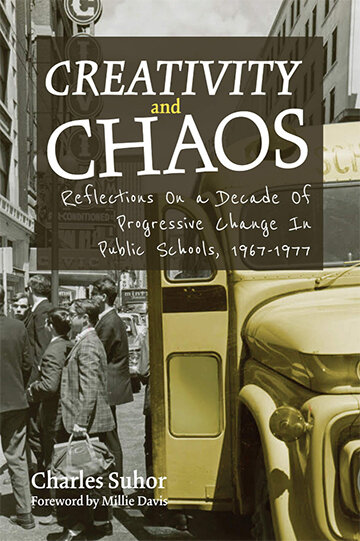
Below are a few others I’ve worked on.
The only novel I’ve had the opportunity to design (so far) is East of Texas, West of Hell by Rod Davis. This one isn’t scheduled to be out until June and I can’t wait to read it. I was given all sorts of rich elemental ideas for this cover design: murder, a burning house, vast farmland, a Jeep, a trailer park, drug addicts, flames, etc. REALLY happy with how the cover leaves you wanting more (well, at least it makes ME want to read more…).
Like I said earlier, I totally (sometimes) pick books based on the cover designs (not always). Heck, my Amazon cart is filled with cool looking books right now. What are they all about? NO IDEA… but the graphic designer was ON POINT!
ADMISSION TIME: I pick wine that way too. Some of my favorite wine-discoveries are from me just browsing down the aisles of the bottle shop. Even my cheap bottles (and boxes...shhh...…) of wine are cute. I’m a sucker for good artistry.
Drop a comment and tell me I’m NOT THE ONLY ONE who makes decisions based on design.
Ok, don’t leave me hangin’…..


